SELECTED WORK · 2026
THE WORK.
Five band concepts. None of them look alike. Three are live demos — click in and explore. Two more shipping soon.
- ACOUSTIC POP PUNK · ST. LOUISVespersquiet songs from a loud place
Warm tones, hand-lettered type, and a layout that feels like opening a journal. Tour dates front and center, merch tucked below the fold.
LIVE DEMO visit site →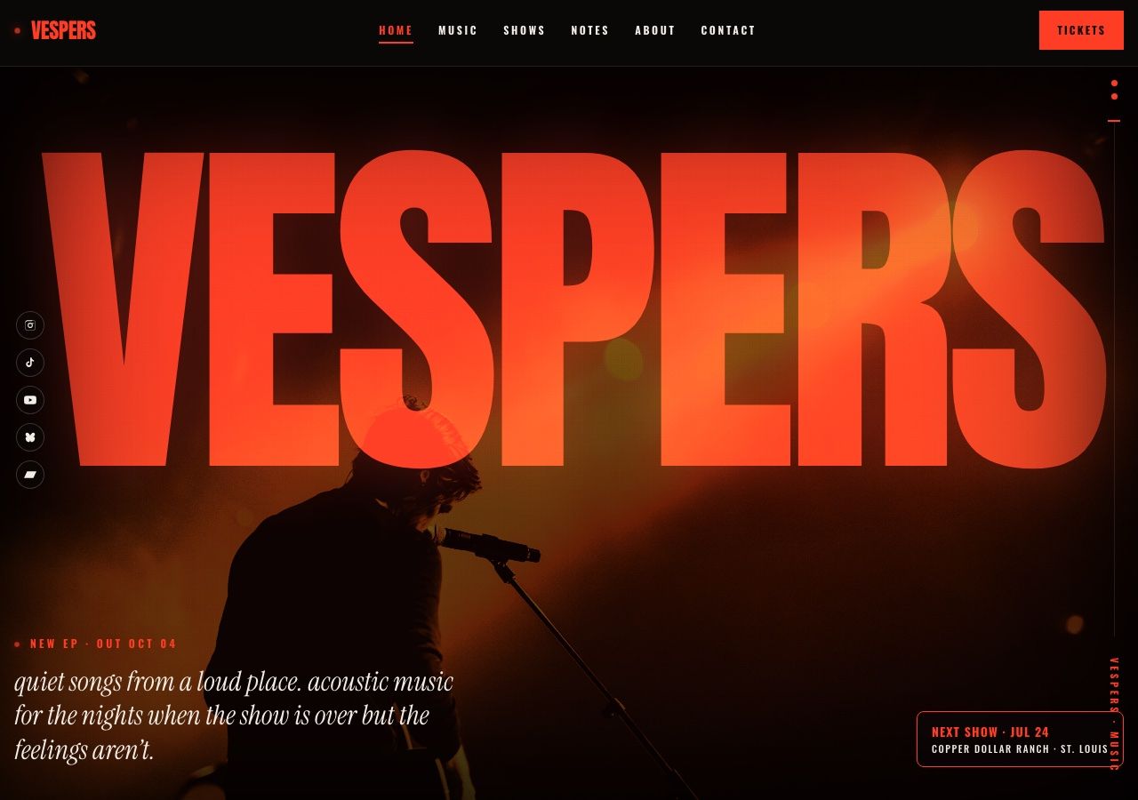
- DIY PUNK · BERLINLoose Toothzine-style, paste-up
Xerox textures, harsh contrast, torn-paper edges. A site that looks like it was photocopied at 3am and stapled to a telephone pole.
COMING SOONDESIGN DIRECTION · PREVIEWLoose Toothzine-style, paste-up - EXPERIMENTAL HIP-HOP · MONTRÉALLa Tundratape only, dubbed in real time
Dark teal, lo-fi grain, cassette UI metaphors. The release page looks like a tape deck. Minimal text, maximum atmosphere.
LIVE DEMO visit site →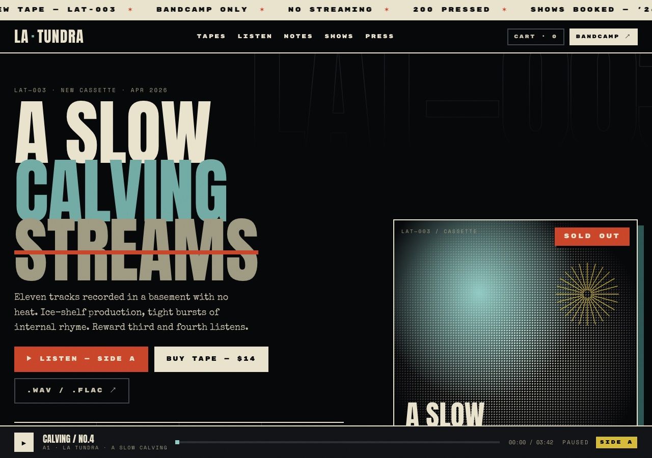
- COUNTRY · NASHVILLEMall Hourswarm Americana, hand-drawn
Hand-drawn illustrations, warm cream palette, serif type that feels like a honky-tonk poster from the 1970s.
COMING SOONDESIGN DIRECTION · PREVIEWMall Hourswarm Americana, hand-drawn - CHAMBER FOLK · BROOKLYNMara Eilish Walshminiaturist of the specific
Quiet, editorial layout. Generous whitespace, large photography, serif headlines. A site that whispers instead of shouts.
LIVE DEMO visit site →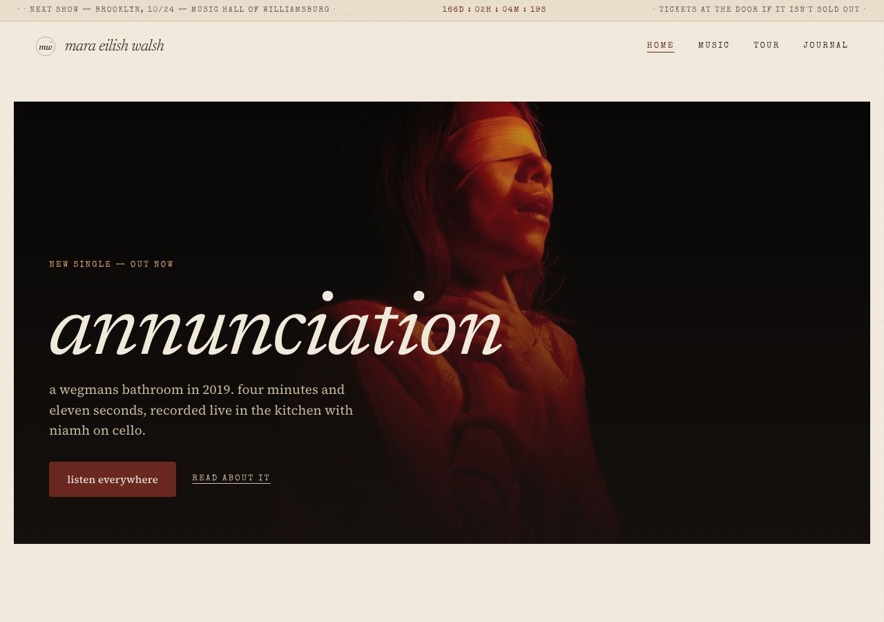


"If the gallery is weak, no copy saves the page. If it's strong, copy barely matters."
— THE BRIEF, PROBABLY